by Lynne Ayers
I’ve been mining my photographs, trying to gauge what it is about a specific photo that appeals to me. The intention is to try to understand my likes and dislikes and with that understanding be better able to paint works that I like. I have edited these in varying degrees and cropped them down to something that caught my eye. I put them all in a square format because that is the orientation I (currently) like for my paintings.
What I like about each of them:
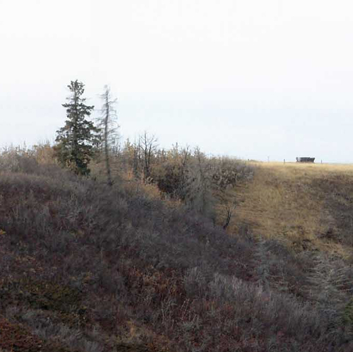
One: I really like the ‘fulcrum’ composition of a larger shape (tree) offset by a smaller shape (rectangle). It’s my favourite composition.
Two: I like the strong shapes layered over a background, giving depth and interest. I’ve been doing a lot of layering in recent pieces.
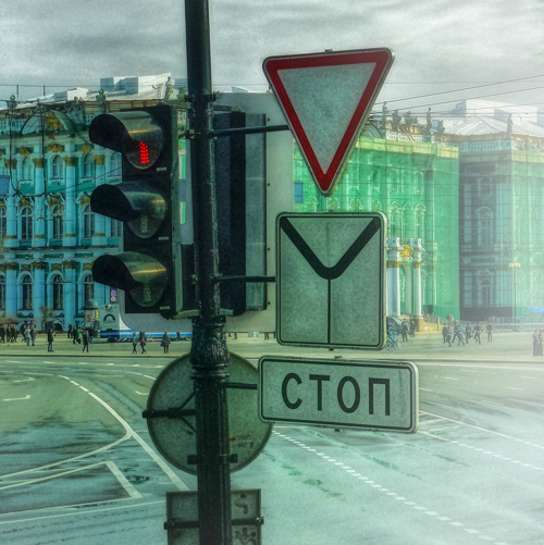
Three: The thing that grabs me every time I look at this is the lovely negative white shape.
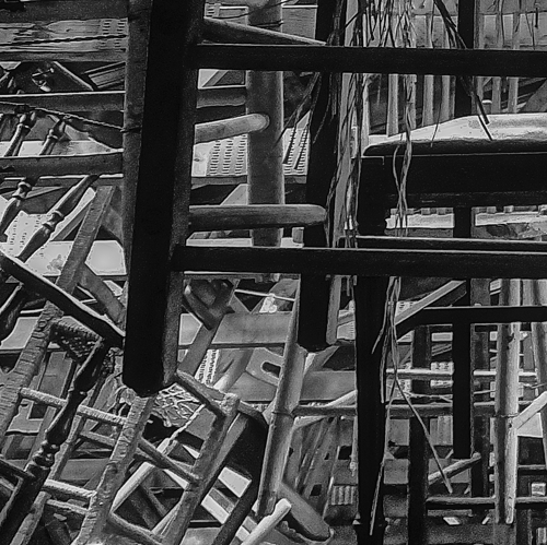
Four: I like all the interlocking shapes created by all the criss-crossing lines in varying thicknesses and shades. It’s chaotic yet appeals to me. Don’t know why.
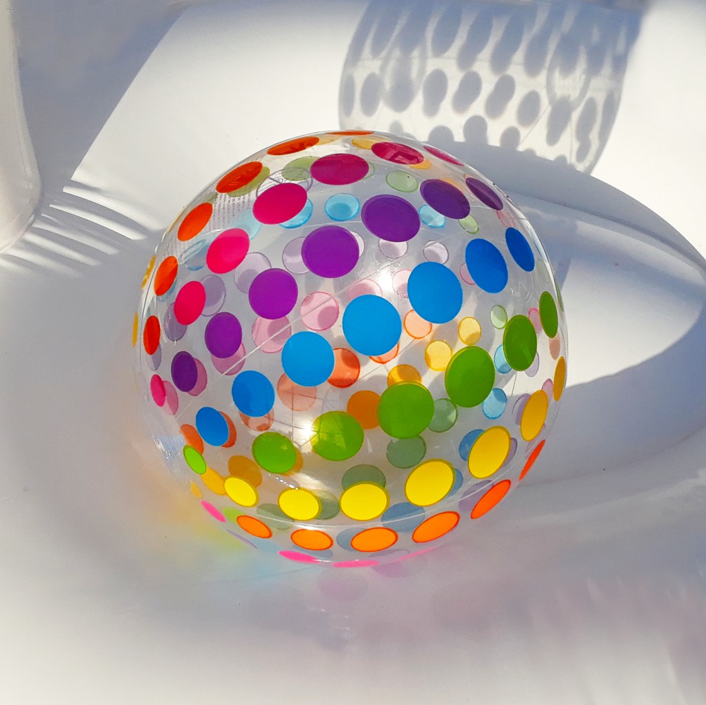
Five: This seems in direct contrast to Four. I like the openness and breathing space of the varied grey shapes contrasted with the controlled colour shapes. And I cropped this one with the ball in the centre, which the “rules” say is incorrect. It didn’t work for me offset. Don’t know why.

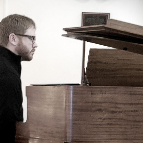
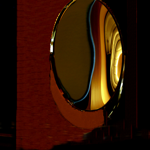
Six: This is about the bold shapes and the way they carve up the picture plane. I find the lamp coming in on the right a necessary component. And I like the strong vertical on the left extending out of the frame.
Seven: This one is about the colour, the black and dark red and the splash of rich gooey colour. I’m afraid of red. You will rarely to almost never see it in my paintings. I think perhaps it’s because it is such a bold colour and I am happier in the background. I’m realising I prefer the neutrals, the earth tones.

Eight: It’s about the line. In my own work I don’t like things to be too mushy and soft. Line, for me, provides strength. I’ve got so much line in my current work and I can’t seem to stop.

Nine: I like all the shapes, all different. The ones closest in shape on the right side have different colouring. Contrary to what I said in Five, I preferred this circle shape slightly offset. Just didn’t seem to work bang on centre. I also like the simplified palette of neutrals with the orange.
lynneayersartist.wordpress.com
Dive in! Share your creative activities! Send JPG image(s) to cagac.ca@gmail.com with up to 100 words per image describing some or all of what moved you to spend time thinking about and producing . . . something! Share how/if creativity affects (controls?) your life.
Writers, send poetry, lyrics, an excerpt. If possible, include an image of some sort.
Creators, share informative, inspiring Show & Tell demonstrating the creative mind.

Thanks for sharing. Lynne Ayers. I found the analyses of your photographs intriguing. For myself, I find it difficult to put into words what I like and don’t like about a picture. The most I can usually say is, “I like the bright colours” or “The shapes are soothing.” I found myself thinking, “Yes, I see what you mean,” as I read your words and then looked back to the photo above.
>
LikeLike
My brain doesn’t retain these analyses right away but I do find that over time they sink in and I find them coming out in my work.
LikeLike
Loved it! Thanks, Lyne for sharing about what inspires you, what you like and dislike. Your pictures are perfect examples. That inspires me to have a different critical and philosophical approach to my upcoming work.
LikeLiked by 1 person
So fascinating!
LikeLike
What a good idea, Lynne! I shall have to try this!
LikeLiked by 1 person